
App Store Screenshots – Guide & Best Practices
Originally Published on July 2021, Updated on June 2023
When browsing through app stores, users decide whether to keep exploring, download the app, or leave within the first 3-6 seconds. That’s why it’s crucial to have visually compelling screenshots that encourage conversions.
App store screenshots are an essential marketing asset that showcases your app’s purpose and functionality through compelling visual storytelling. These critical marketing messages are designed to capture the attention of potential users and motivate them to download your app.
By utilizing creative visuals, you can tell a comprehensive story that engages potential users with relatable insights and displays your app’s unique selling points (USPs) in their language.
Even if your app has the best features and offers an exceptional user experience, mediocre screenshots will turn off potential users. They’re likely to choose a competitor with a more professionally designed and better-looking page.
That’s why paying attention to every detail of your app store page and ensuring that your visuals are top-notch is essential in getting your app in front of as many potential users as possible.
Since a picture speaks a thousand words, app store screenshots are invaluable to any app store optimization strategy. To help you improve your app’s retention rate, ranking, downloads, and conversions, we’ve crafted a comprehensive guide on optimizing iOS and Google Play app store screenshots.
Our guide is designed to elevate your app’s visibility, capture the attention of potential users, and boost engagement. By following our recommendations, you’ll optimize the app store experience and enhance your app’s performance.
Let’s dive right in!
Why Are App Store Screenshots Important?
Your app marketing strategy is paying off, and thousands of people are being exposed to your app. However, all of your efforts and budget will go to waste unless you convince your visitors to download your app.
Failing to optimize your screenshots can not only impede your growth but also escalate your operational costs and reduce your revenue.
App store screenshots allow you to show off your app’s best features and functionalities to users that visit the app page. In fact, your app icons, app store videos, and screenshots can provide greater insights into your app than its name or the app description.
We could easily say that in ASO, visuals speak (much) louder than copy.
Want to create the best App Store Screenshots?
Our ASO experts and Marketing specialists are here to help you achieve success.
How to Optimize Your App Store Screenshots
Crafting app store screenshots that communicate the right message and display your app’s features is more of an art form than a scientific method. It’s vital to provide people with an understanding of how they can use your app before they install it to prevent increased churn rates.
If you wish to deliver high-quality screenshots, make sure to read below and follow these four simple yet crucial steps:
1. Deliver the right message through your images.
2. If you go global, remember to localize your visuals.
3. A/B test and test again.
4. Use the right sizes and dimensions.
Let’s break down each of these steps to help you achieve the best results.
Deliver the Right Message Through Your Images
Showcasing your app’s features, presenting a story through your screenshots, and delivering the right message should be one of the main points of your app store presence.
When designing app screenshots, you should make sure that people can get information from your images – either regarding how the app works or how the app can be useful to the user.
Follow these best practices to maximize the impact of your app screenshots:
Use Big, Bold Fonts
When it comes to creating app screenshots for any app store, using big, bold fonts is a critical component of crafting an effective and eye-catching design. There are several reasons why this is the case.
- Big, bold fonts are much easier to read on smaller screens and can quickly communicate your app’s key features and benefits.
- They can help your app stand out from the competition. The app stores are a crowded marketplace, and using big, bold fonts can help your app grab the attention of potential users and encourage them to click through to your app’s page.
- Finally, using a consistent font style and size across your screenshots can help users recognize your brand and create a sense of familiarity and trust with your app.
Utilize Contrast
Using contrast in app store screenshots is essential for several reasons:
- Firstly, it can help make your screenshots more visually appealing and engaging, which can encourage users to explore your app further. By using contrasting colors or images, you can create a more dynamic visual experience that stands out from other apps in the same category.
- Secondly, it can significantly improve the readability of your screenshots. With so many apps available in app stores, users are often presented with overwhelming information on each page. By utilizing contrast, you can highlight key text and images to make them stand out and easier to read. This can help ensure that potential users understand the purpose and functionality of your app quickly and efficiently.
- Moreover, contrast can also help with accessibility by making it easier for visually impaired users to navigate your app store page. By using contrasting colors and bold fonts, you can improve the legibility of your text and make sure that users with visual impairments can read and engage with your content more easily.
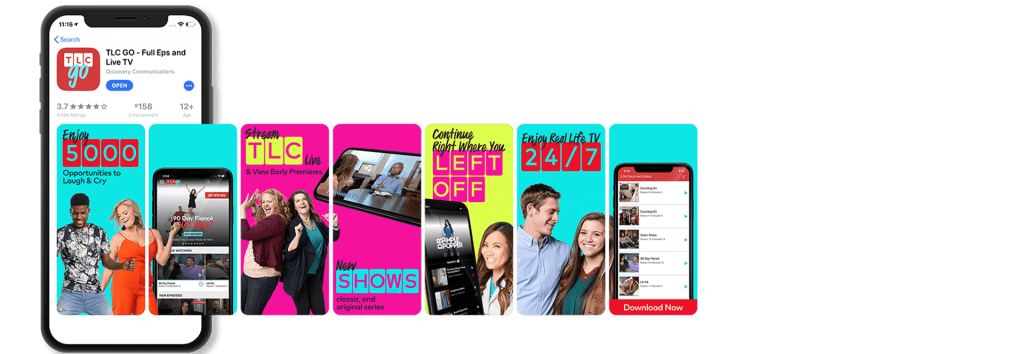
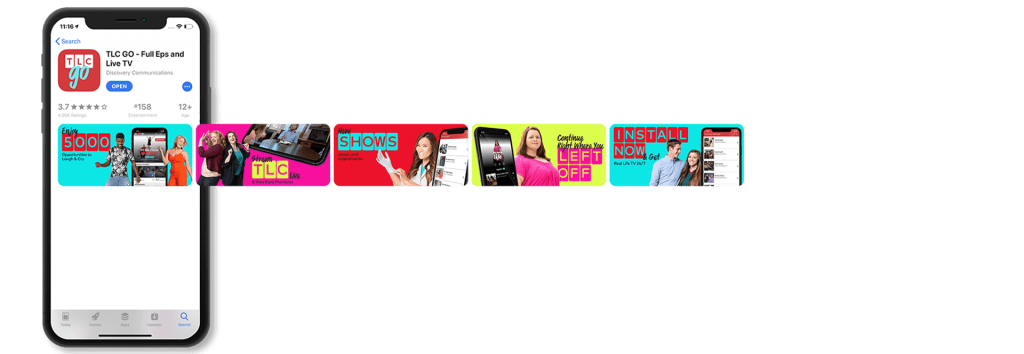
Show the Right Device & UI Amount
Finding the balance between showcasing an app’s user interface (UI) to highlight its features and benefits while also allowing room for user imagination is key. Additionally, we advise displaying up-to-date devices that are applicable to the platform (iOS/Android) in all screenshots.
Showing too little UI can leave users confused about what your app does or how it works while showing too much UI can overwhelm users and make it difficult for them to understand the most important features and benefits of your app.
By carefully selecting which UI elements to showcase in your screenshots, you can create a clear and concise representation of your app’s functionality and key selling points. This can help to attract potential users and encourage them to download and engage with your app.
It’s also important to consider the context in which your screenshots will be viewed. For example, if your app is primarily used on mobile devices, it’s important to ensure that your screenshots are optimized for smaller screens and clearly indicate how your app works on a mobile device.
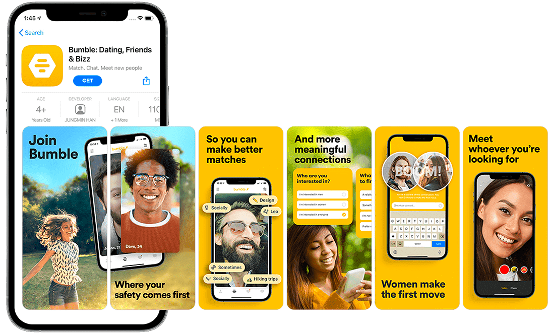
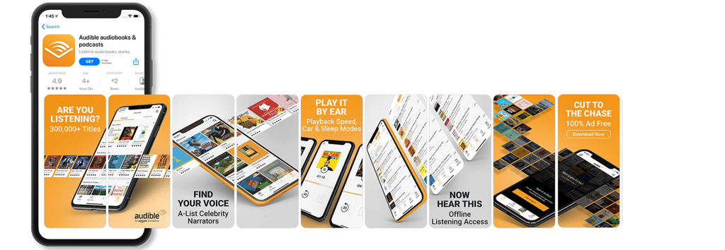
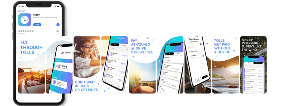
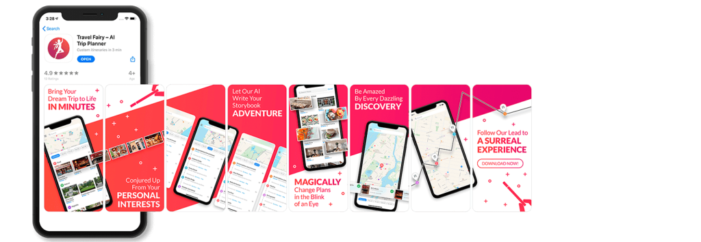
Pro Tip: You can also overlap your best UI screenshots to make the user want to explore more, as seen below.
Keep it Fun & Playful
In addition to showcasing the key features and benefits of your app, it’s also important to keep the design of your app store screenshots fun and engaging. A fun and visually appealing design can help to capture users’ attention and create a positive emotional connection with your app.
One way to do this is by using playful graphics or bright colors to create a sense of excitement and energy in your screenshots or by playing around with the text placement. This can help to convey the overall tone and personality of your app, making it more memorable and appealing to potential users.
Another way to keep the design fun is by incorporating user-generated content or social proof into your screenshots. For example, you could include screenshots of positive reviews or user testimonials to show potential users that your app is well-loved and highly recommended.
Want to create the best App Store Screenshots??
Our ASO experts and Marketing specialists are here to help you achieve success.
Localization, Localization, Localization
Localizing your app is one of the best ways of ranking better and increasing the number of app installs. Both app stores allow you to integrate new screenshots for each language.
You should take advantage of this feature and work on making sure that you fully understand the target market and plan the images accordingly.
If you are targeting countries with a different alphabet, that alphabet should also be present in the images and screenshots.
Also, take into consideration a cultural approach, as you may need to change the way the art or images look for your app store screenshots.
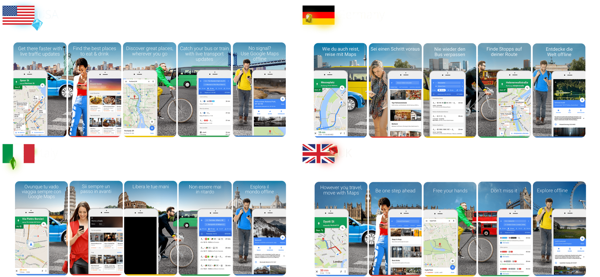
To illustrate, take a look at the localized app screenshots we created for Google Maps, tailored to specific locations. By using local language and showcasing relevant scenery, users were more likely to click on the app and ultimately download it. This highlights the importance of customizing your app store screenshots to appeal to your target audience’s language and culture.
- For more information about how to localize and internationalize your app, check out our full guide here.
A/B Test and Test Again
A/B testing your app screenshots is the leading way to maximize your performance by comparing app store screenshots to one another, seeing which yields better conversion rates.
You’ll learn which style speaks to your target demographic, what design makes users take action, what background color works best, and what layouts reel in the most downloads while maximizing ROI.
Want to create the best App Store Screenshots??
Our ASO experts and Marketing specialists are here to help you achieve success.
Use the Right Sizes, Dimensions & Orientation
Your app store screenshots need to cater to all the various phone and tablet sizes that your users could have.
While the Google Play store gives us a helping hand by providing a minimum and maximum size for its screenshots, Apple makes the game a little more complicated. Right now, Apple requires a different image and screenshot resolution depending on the device.
Pro tip: Take into consideration that different OS versions will show the app store differently.
Apple App Store Screenshot Sizes
The Apple App Store requires only one screenshot per app and localization while also allowing a maximum of ten screenshots.
In order for the app screenshots to be accepted, your files need to have a 72 dpi resolution without transparency and be saved as either flattened JPEGs or PNGs.
We’ve also summarized below all of the screenshot sizes an app can use on the Apple App Store.
iPhone app screenshot sizes:
- 3.5″ Display (iPhone 4s): 640 x 960 px (portrait with status bar), 960 x 640 px (landscape with status bar)
- 4″ Display (iPhone SE – 1st gen): 640 x 1136 px (portrait with status bar), 1136 x 640 (landscape with status bar)
- 4.7″ Display (iPhone SE – 2nd generation, 3rd generation + 6/6s + 7 + 8): 750 x 1334 px (portrait), 1334 x 750 px (landscape)
- 5.5″ Display (iPhone 6s Plus + 7 Plus + 8 Plus): 1242 x 2208 px (portrait), 2208 x 1242 px (landscape)
- 5.8″ Display (iPhone X + XS + 11 Pro + 12 + 12 mini/Pro + 13 + 13 mini/Pro + 14): 1170 x 2532 px (portrait), 2532 x 1170 px (landscape), 1125 x 2436 px (portrait), 2436 x 1125 px (landscape), 1080 x 2340 px (portrait), 2340 x 1080 px (landscape).
- 6.1″ Display (iPhone 14 Pro): 1179 x 2556 px (portrait), 2556 x 1179 px (landscape).
- 6.5″ Display (iPhone XR, XS Max, 11, 11 Pro Max, 12 Pro Max, 13 Pro Max, 14 Plus): 1284 x 2778 px (portrait), 2778 x 1284 px (landscape), 1242 x 2688 px (portrait), 2688 x 1242 px (landscape).
- 6.7″ Display (iPhone 14 Pro Max): 1290 x 2796 px (portrait), 2796 x 1290 px (landscape).
iPad app screenshot sizes:
- 9.7″ Display (iPad, iPad mini): 1536 x 2008 px (portrait without status bar), 1536 x 2048 px (portrait with status bar), 2048 x 1496 px (landscape without status bar), 2048 x 1536 px (landscape with status bar), 768 x 1004 px (portrait without status bar), 768 x 1024 px, (portrait with status bar), 1024 x 748 px, (landscape without status bar), 1024 x 768 px (landscape with status bar).
- 10.5″ Display (iPad – 7th, 8th & 9th generation, iPad Pro, iPad Air): 1668 x 2224 px (portrait), 2224 x 1668 px (landscape).
- 11″ Display (iPad mini – 6th generation, iPad Air – 4th & 5th generation, iPad – 10th generation, iPad Pro – 3rd & 4th generation): 1488 x 2266 px (portrait), 2266 x 1488 px (landscape), 1668 x 2388 px (portrait), 2388 x 1668 px (landscape), 1640 x 2360 px (portrait), 2360 x 1640 pixels (landscape).
- 12.9″ Display (iPad Pro – 2nd generation and above): 2048 x 2732 px (portrait), 2732 x 2048 (landscape).
While they do not fall into the general devices you would optimize your app for, sometimes, an app can be used for bigger devices as well (take Netflix as an example).
Because of this, we took the liberty of providing you the screenshot sizes for Macs, TVs, and watches as well.
Other devices:
- Mac:
- 1280 x 800 px
- 1440 x 900 px
- 2560 x 1600 px
- 2880 x 1880 px
- Apple TV
- 1920 x 1080 px
- 3840 x 2160 px
- Apple Watch Series 3: 312 x 390 px
- Apple Watch SE, Series 4, 5 & 6: 368 x 448 px
- Apple Watch Ultra: 410 x 502 px
Should you include the status bar with App Store screenshots? That’s up to you, but if you are including it, ensure you’re always using the iOS version.
Google Play Store Screenshot Sizes
Google allows only eight screenshots for each device your app is offered on. You will need to add the screenshots in different tabs for each device type:
- Phones
- Tablets
- TVs
- Wearables running wear
Google Play Store listings require a minimum of two screenshots that must adhere to the following rules:
- JPEG or 24-bit PNG (no alpha)
- Minimum dimension: 320px
- Maximum dimension: 3840px
- An aspect ratio of 16:9 or 9:16
- Max size of 8 MB for each screenshot
Google Play offers more flexibility in screenshot sizes than the iOS App Store, giving developers greater opportunities to showcase their products. On the other hand, this creative freedom also comes with a drawback – creating captivating designs that fit is often a challenge. A poorly-sized screenshot can hinder your chances of impressing potential users, making it vital to strike a balance between creativity and consistency.
For example, it is possible that design elements such as text could be cropped out when Google makes its resizing adjustments in order to present them properly. Therefore, we suggest making sure to center the information you want to present and make the images as big as possible in order to avoid such a pitfall.
Furthermore, the device you’re optimizing for must also be considered when it comes to designs. One such instance is in the case of wearables, where most devices have round screens. This means your screenshot will be cropped to a round circle, so keep that in mind, especially when it comes to text placement.
Should you include the status bar with Google Play screenshots? Unlike our App Store recommendation, we recommend always removing it from your designs.
How to Orient Your Google Play App Store Screenshots?
While there are no standard sizes that Google requires, there are some best practices we’ve uncovered for both portrait and landscape orientations.
- Portrait: The traditional portrait landscape is pretty much standard for any app store listing. In fact, we recommend sticking to the portrait orientation in 90% of the cases. One of its advantages is the opportunity it presents to showcase several frames from the search results view. However, because of its narrow shape, text in these types of frames is very difficult to read. Previously designed using a 9:16 aspect ratio, we have discovered that employing a 4:3 ratio instead results in a much more readable “hybrid portrait.”
- Landscape: Previously, the best practice for employing landscape-oriented screenshots was to do so using a 16:9 aspect ratio. While this would provide developers with plenty of screen real estate in which to attract users who come across their app via organic searches, it isn’t one without its drawbacks.
For example, the use of the wide landscape frame makes creating “panoramic galleries” extremely difficult. This is especially true when it comes to determining how wide to make the gap between frames. Additionally, unlike portrait screenshots, the inability to view more than one landscape frame at a time can result in a never-ending scrolling effect. In an age where attention span runs at a premium, this could mean fewer installations due to users abandoning your app listing before reaching the call-to-action at the end.
One compromise we have discovered to get around this challenge is to use a screenshot with a 4:3 aspect ratio. This creates a frame that affords the developer ample space for images requiring more width. As well it also creates some “scroll bait” by enabling the user to catch a glimpse of the next screenshot in the sequence to hopefully help keep them engaged.
Landscape Orientation for Mobile Games
If you’re a mobile gaming app developer the landscape orientation is an absolute must when it comes to your Google Play Store listing. In fact, in order to be the “Recommended Games” collection, your listing must include a minimum of three landscape screenshots. Additionally, gamers are used to using the phone in landscape mode in order to play their favorite games.
Additionally, if the user interface (UI) of your mobile game is in landscape orientation, it would be beneficial to focus on capturing landscape screenshots to vividly exhibit your game’s features.
Pro Tip: if you’re not sure which orientation to use, we suggest running an A/B test on your app’s screenshots. Landscape screenshots don’t tick all the boxes for every game, and other variables should also be taken into account.
Final Words
In conclusion, creating effective app store screenshots is a key component of a successful app marketing strategy. If you’re looking to take your app store screenshots and other assets to the next level, consider partnering with an ASO agency to create your app store assets. With our expertise and experience in the space, we can help you create a compelling and effective visual identity for your app that drives downloads and maximizes ROI.
FAQs (Frequently Asked Questions)
– Use the right sizes and dimensions.
– Deliver the right message & explain your app.
– If your app is global, remember to localize.
– A/B test repeatedly.
Portrait app store screenshots are definitely the more common of the two. They allow you to showcase several frames without the need for scrolling and are perfect for the panoramic effect, where you can carry designs across two screenshots. However, because of their narrow shape, text in these types of frames is very difficult to read. Landscape app store screenshots are not good for a panoramic gallery, and usually, only one screenshot is visible at a time.
A/B testing allows you to test various screenshot designs and concepts to each other and see which yields better conversion rates. You’ll learn which style speaks to your target demographic, what design makes users take action, what background color works best, and what layouts reel in the most downloads.

Related Articles

App Startup Marketing on a Budget for Hypergrowth

What Is a Long-Term Growth Architecture in Mobile Marketing?