
Best Landing Page Design Trends for 2026 & Beyond

Your landing page has roughly three seconds to make an impression. In that blink of time, visitors decide whether to stay, scroll, convert, or bounce. With paid media costs climbing year over year and attention spans shrinking, your landing page design isn’t just a creative exercise; it’s a revenue-determining factor.
The landing page design trends shaping 2026 reflect a big shift in how brands communicate online: smarter personalization powered by AI, bolder visual choices, and a relentless focus on reducing friction. Whether you’re building pages for lead generation, product launches, or e-commerce, the principles below will help you stay ahead of the curve and turn more clicks into customers.
Why Landing Page Design Trends Matter More Than Ever
Average cost-per-click across major ad platforms has risen steadily since 2022. When every click costs more, every percentage point of conversion rate improvement translates into real savings and real growth for your brand. Design is one of the highest-leverage areas to optimize because it shapes the entire user experience from first impression to final purchase or booking.
There’s a performance dimension here, too. Google’s Core Web Vitals continue to influence both organic rankings and Quality Scores for paid campaigns. A page that loads slowly, shifts layout unexpectedly, or fails to respond to user input quickly will lose visitors before they even see your offer. The best landing page designs in 2026 balance aesthetics and technical performance.
There’s also the expectation factor. People are accustomed to polished, app-like digital experiences. A landing page that looks dated or generic signals a brand that isn’t keeping up, and that tarnishes trust before the visitor even reads a single word of copy.
AI-Personalized Landing Pages
If there’s one trend defining 2026, it’s this: the static, one-size-fits-all landing page is being replaced by dynamically personalized experiences. AI engines now analyze visitor data (traffic source, device, geographic location, time of day, and even behavioral signals from previous sessions) to serve content tailored to each individual.
In practice, this means a visitor arriving from a LinkedIn ad campaign might see a headline, hero image, and testimonial that speak directly to B2B decision-makers, while someone arriving from an Instagram Story sees a mobile-optimized layout with lifestyle imagery and a more casual tone. The URL stays the same, but the experience adapts.
AI-driven A/B and multivariate testing accelerates the optimization cycle, too. Instead of manually setting up test variants and waiting weeks for statistical change to show, machine learning models can test dozens of headline, image, and CTA combinations simultaneously and converge on the highest-performing version faster.
Tools like Mutiny, Unbounce Smart Traffic, and Intellimize have matured considerably, making this level of personalization accessible even to mid-market teams without dedicated data science resources.
Want landing pages that actually convert?
Let’s talk.
Immersive Micro-Interactions and Motion Design
Scroll-triggered animations, hover effects, and subtle motion cues have moved from “nice to have” to expected. Done well, micro-interactions guide the visitor’s eye through the page, highlight key information at the right moment, and create a sense of craft and quality that static pages simply can’t replicate.
The key phrase here is “done well.” Heavy animations that delay content rendering or cause layout shift will hurt both user experience and Core Web Vitals. The best implementations in 2026 use lightweight CSS and JavaScript animations, load assets lazily, and degrade gracefully on lower-powered devices. Think of a CTA button that pulses gently when it enters the viewport, a counter that animates upward as the user scrolls past a stats section, or a product image that subtly scrolls behind a text overlay.
The goal is to add a layer of interactivity that makes the page feel responsive and alive without ever making the visitor wait.
Bold, Oversized Typography as a Visual Anchor
Hero images have long been the default above-the-fold centerpiece. In 2026, more and more brands are replacing them (or complementing them) with bold, oversized typography that makes the value proposition impossible to miss.
Large statement headlines work because they solve two problems at once. First, they communicate the core message instantly, even on a quick scroll-by. Second, they reduce dependency on imagery that may not render quickly or may lose impact on smaller mobile screens.
Variable fonts are enabling more creative typographic expression without loading multiple font files. Kinetic type (text that animates on scroll or interaction) adds another layer of visual engagement. When paired with generous white space, oversized type creates a sense of confidence and clarity that resonates with today’s audiences.
One important note on accessibility: large type is inherently more readable, but designers should ensure sufficient color contrast, proper heading hierarchy for screen readers, and that animated text doesn’t trigger motion sensitivity issues.

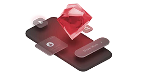
AI-Generated and 3D Visual Assets
Stock photography has always been a compromise. It’s fast and affordable, but it’s also generic, and visitors can spot a stock image from a mile away. AI image generation has reached a quality threshold where brands can create custom, on-brand visuals that feel authentic without commissioning a full photo shoot.
This is especially powerful for landing pages where speed to market matters. Need a hero image for a campaign launching tomorrow? AI can generate multiple on-brand options in minutes. Need to localize imagery for different markets? AI makes that economically viable in a way it wasn’t before.
Lightweight 3D elements are also gaining traction: product renders, floating UI mockups, and isometric illustrations that add depth and dimension to flat layouts. Tools like Spline and Three.js enable embedding interactive 3D elements that run smoothly in the browser. The trick is keeping file sizes small. Remember: a 3D element that adds three seconds to page load is a net negative regardless of how impressive it looks.
Minimalist “Anti-Design” and Intentional White Space
The pendulum is swinging back from information-dense layouts to stripped-back, more focused designs. The “anti-design” movement, characterized by generous white space, limited color palettes, and a single clear call to action, is gaining ground precisely because it works.
Cognitive load research consistently shows that reducing the number of choices on a page increases the likelihood of conversion. A landing page with one headline, one supporting paragraph, one visual, and one CTA button gives visitors nothing to deliberate over. It’s persuasive through clarity.
This doesn’t mean boring. Minimalist pages can still use striking typography, unexpected color accents, or a single bold visual element to create impact. The discipline is in restraint: every element must earn its place on the page. If it doesn’t directly support the conversion goal, it gets scrapped.
Think your pages are trying to do too much?
We can help you focus on what converts.
Dark Mode and Adaptive Color Schemes
Dark mode isn’t a novelty anymore; it’s a user expectation. Across operating systems, browsers, and apps, a significant portion of users have dark mode enabled by default. Landing pages that don’t adapt can feel jarring, like walking into a brightly lit room after a dim hallway.
The best landing page designs in 2026 detect the user’s system preferences and automatically serve an appropriate color scheme. This goes beyond simply inverting colors. It requires thoughtful design of both light and dark variants to ensure readability, brand consistency, and visual hierarchy are maintained in each mode.
High-contrast color palettes, like deep blacks paired with vibrant accent colors, can create a dramatic, premium feel in dark mode. For brands targeting younger, tech-savvy demographics, dark-mode-first design can even serve as a positioning signal.

Conversational and Chat-First Layouts
Static lead capture forms have been the workhorse of landing pages for over a decade. They’re not going away entirely, but they’re increasingly being supplemented, or replaced, by conversational interfaces.
AI-powered chatbots can now engage visitors in natural dialogue, qualify leads in real time, and route them to the appropriate next step (booking a call, downloading a resource, starting a free trial) based on their responses. This reduces form friction significantly. Instead of filling out six fields and hitting submit, the visitor answers a few conversational questions and arrives at a personalized recommendation.
Interactive quizzes and assessments are another variant of this trend. A financial services company might replace a generic “Contact Us” form with a three-question quiz that matches visitors to the right advisor or plan. The experience feels helpful rather than transactional, and completion rates tend to be meaningfully higher than traditional forms.
Mobile-Native Design, Not Just Mobile-Responsive
Responsive design solved the problem of making desktop pages readable on smaller screens. But in 2026, with mobile traffic accounting for the majority of visits for most industries, the best-performing pages aren’t just adapted for mobile. They’re designed for it from the start.
Mobile-native design means thinking about thumb zones (keeping CTAs within easy reach of one-handed use), gesture-based navigation (swipe carousels, pull-to-reveal content), and vertical-first media (video and imagery composed for portrait orientation, not cropped from landscape).
Scroll storytelling, where the page narrative unfolds as the user scrolls with content, imagery, and animations triggered by scroll position, is particularly effective on mobile. It leverages the platform’s natural gestures and keeps users engaged through a controlled, sequential experience.
Performance is non-negotiable. Mobile users are often on variable connections. Lazy loading, next-gen image formats like AVIF and WebP, minimal JavaScript, and efficient caching strategies are baseline requirements, not optimizations.
If your landing pages are still being adapted from desktop rather than built mobile-first, you’re likely leaving conversions on the table. Let’s find out where. Talk to our team about a mobile UX audit.
Trust-First Design Elements
Trust has always mattered in conversion. What’s changing is the explicitness with which landing pages communicate it. With AI-generated content and deepfakes eroding baseline trust online, visitors are looking for more tangible proof that a brand is legitimate and its claims are real.
Prominent social proof (real customer testimonials with names and photos, verified review scores from third-party platforms, real-time usage stats like “347 teams signed up this month”) provides that proof. The more specific and verifiable the evidence, the more persuasive it is.
Transparent pricing is another trust signal. Landing pages that hide costs or require contact before revealing pricing create friction and suspicion. Where possible, leading with clear, honest pricing, even if it’s “starting at” pricing, reduces anxiety and self-qualifies visitors.
Privacy-forward messaging is the final piece. As third-party cookies disappear and data privacy regulations expand globally, visitors are more attuned to how their information is used. Landing pages that clearly communicate their data practices, minimize required form fields, and avoid dark patterns build trust at a moment when trust is in short supply.
This doesn’t mean boring. Minimalist pages can still use striking typography, unexpected color accents, or a single bold visual element to create impact. The discipline is in restraint: every element must earn its place on the page. If it doesn’t directly support the conversion goal, it goes.
Are your landing pages earning visitor trust or losing it?
Get an honest assessment.
How to Put These Trends Into Practice
Knowing the trends is the easy part. Implementing them effectively requires a systematic approach.
Start with an audit. Review your highest-traffic landing pages against the trends outlined above. Where are the biggest gaps? Which changes are likely to have the highest impact on your specific audience and conversion goals?
Prioritize by impact and effort. Not every trend will be relevant to every business. A B2B SaaS company might prioritize AI personalization and conversational layouts, while a D2C brand might get more mileage from mobile-native design and bold typography. Map potential changes on a simple two-by-two matrix of expected impact versus implementation effort, and start with the high-impact, low-effort quadrant.
Test iteratively. Resist the temptation to overhaul everything at once. Make one significant change at a time, measure the effect on your core KPIs (conversion rate, cost per lead, bounce rate), and build on what works. A/B testing remains the gold standard for guiding design decisions, and AI-powered testing tools can accelerate the cycle.
Don’t sacrifice speed for style. Every design choice should be evaluated not just for its visual impact but for its effect on page performance. A gorgeous animation that adds two seconds to load time is a net loss. Use Lighthouse, PageSpeed Insights, and real-user monitoring to keep performance in check as you evolve your designs.
The Takeaway
The best landing pages in 2026 share a common thread: they’re built around the visitor, not the brand. They adapt to individual preferences, communicate with clarity and confidence, and make the path to conversion as frictionless as possible.
The trends outlined here, from AI personalization and conversational layouts to bold typography and trust-first design, aren’t just aesthetic fads. They reflect genuine shifts in user behavior, technology capabilities, and competitive expectations. Brands that adopt them thoughtfully, test them rigorously, and optimize them continuously will capture more value from every click.
Frequently Asked Questions
The biggest trends shaping landing page design in 2026 include AI-powered personalization, mobile-native layouts, conversational lead capture via chatbots and quizzes, bold, oversized typography, and trust-first design elements such as transparent pricing and verified social proof.
There’s no fixed schedule, but a good rule of thumb is to audit your highest-traffic landing pages at least once a quarter. Look at performance metrics such as conversion rate, bounce rate, and time on page to identify where design changes could make a meaningful difference. You don’t need to overhaul everything at once. Small, tested changes over time tend to produce better results than a full redesign every year or two.
Yes, though there’s more overlap than you might expect. B2B pages tend to benefit most from AI personalization, conversational layouts, and trust signals like case studies and client logos. B2C pages often see stronger results from bold visuals, mobile-native design, and streamlined single-CTA layouts. The key is matching the trend to your audience’s expectations and your specific conversion goal.
Start with the data. If your bounce rate is high, your conversion rate is declining, or your pages load slowly on mobile, those are clear signals. Beyond metrics, take a hard look at the experience itself. Does the page feel modern and fast? Is the CTA obvious and easy to reach on a phone? Does the design build trust quickly? If the answer to any of those is no, it’s worth exploring what a refresh could do for your results.

Related Articles

Content Writing for Websites: Where to Start

Top Web Development Trends You Need to Know in 2026 & Beyond
