


At first we thought it’s an April Fools joke, but it turns out it’s really happening – Google is seemingly removing the feature graphic from their Play Store! And it doesn’t end there; multiple changes occured on the Play Store without any warning. Changes that will completely transform the way we present apps on the Google Play Store, and require a complete re-thinking of the ASO creative strategy.
How so?
Feature Graphic
For starters, as the first and biggest visual item on the page, the feature graphic was the first thing your eyes landed on when reaching an app’s page. Now, an app’s page looks completely different than just a few days ago – as you can see on Pinterest’s:
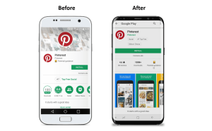
Indeed, constant testing we conducted proved beyond a doubt the importance of the feature graphic in the users’ decision whether to download the app or not. Much more than the screenshots, icon or any other creative element within the store, the feature graphic had the most impact on in-page conversion rate.
Another reason is the text; with the most room available, the feature graphic was the ultimate place to capture the user’s attention with a short and to-the-point call to action, with just a few words. Now, however, we advertisers lost a grand spot to talk to the user, the Play Store’s billboard, if you will. Below you can see 3 app pages with no feature graphic to be found…
As you can understand, the feature graphic was the main element that got people to download the app. Not having it anymore drastically changes the entire visual appearance of the page, and therefore needs a new strategy. For better or worse? Perhaps both, but we really believe this gives us a lot of room for maneuver, ingenuity and new possibilities with new creative thinking. We can AB test, try different elements until we find the perfect formula for each app.
In the past, when testing many elements within the store, we saw that the most significant growth came by playing with the feature graphics, and therefore we focused much more on the feature graphics than the screenshots (unlike the App Store, where the screenshots have the most crucial affect).
Due to that, and especially if you are a data-driven person, you probably did the same so if you worked on AB tested. Which means, that you didn’t invest too much time on the screenshots optimization of each and every screen, i.e. your new app page in now not optimized and needs a whole new strategy and a complete makeover.
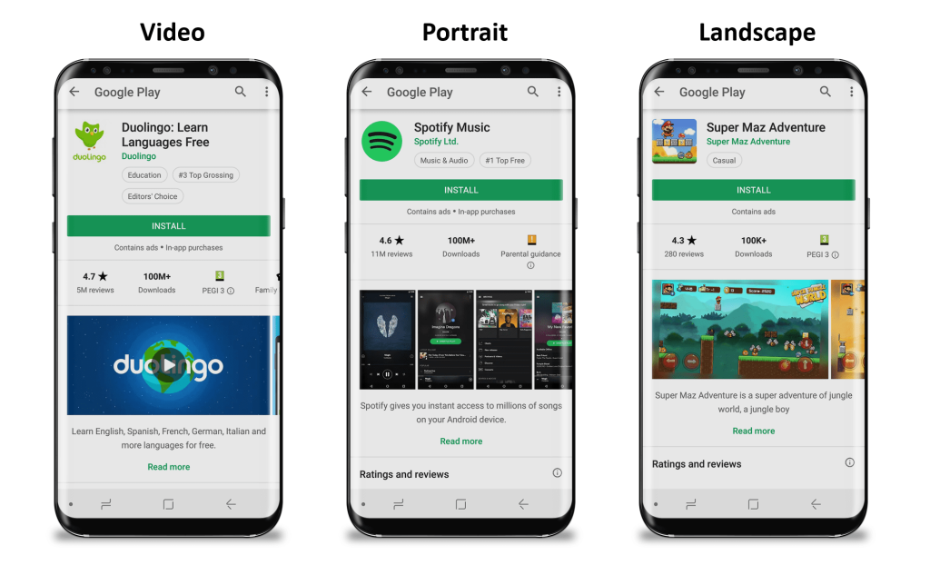
Screenshots
Another game-changer from Google can be found in the screenshots section, which became more important as they moved up and can be seen at a first glance. It seems they have thrown away all rules – you can upload any image you want. You could always do that but now it appears very different in the page. It can be portrait or landscape, any width or resolution and it will be shown differently in the store and will affect the users differently. This causes some apps to show only two images before scrolling, and others almost four! Both, in fact, can be good, if used correctly. It varies from industry to the other, depends on the messaging and brand. This might cause a bit of confusion, but also a great opportunity in the right hands.
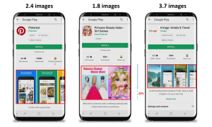
As you can see in the images below, you have a maximal capacity which is similar for two images or a little more; if you have the four images version, on the other hand, you seem to lose roughly 25% in the images space’s length.
More Changes
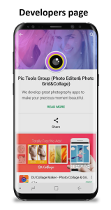
Developers’ page – When on an app’s page, you can click on the developer’s name. If defined, you will get to a new page that tells about the parent company, with… a feature graphic! This is an extra space to market your app, and a great stop to tell the world who you are…

Features ranking – Underneath the reviews you can find a new ranking section, that gives 1-5 scores to specific features of the app, based on the relevance for each app.
We were also introduced to a new design for the bubbles. Right after the app’s name you can see a bubble with the app’s category, and for high ranking apps you can see another bubble with its score. Now they were given a new and cleaner design, to go along with the new page layout.
Last and not totally new, there’s another significant change to the Play Store worth mentioning, and this one is in the search results page. There are two main types of searches; ones that look for a function (such as “Navigation”), and others who enter a specific app’s name (“Google Maps” for example). The former will generate a list of apps, while the latter will give the requested app on top, with 6.5 screenshots densely pressed together.
Conclusion
These changes are beyond important. Unlike Apple’s strict policy and rules, Google is positioning itself in a much more flexible and “easy-going” store, allowing us creative freedom to express ourselves and to sell our apps. Like previous changes in App Stores, we choose to see all the marvelous window it opened to us to be more exciting and far more creative.

Related Articles
Digital Transformation Roadmap for Traditional Businesses
Travel App Marketing Beat OTAs With Seasonal Strategy