The App Store has drastically changed with the release of iOS 11 and the new iPhone X. From the way apps appear on the search page, to the difference between landscape and portrait mode – there’s a lot to know. As a mobile marketing agency that works with leading brands, we got you covered. Read on to learn about the recent changes to promote your app effectively.
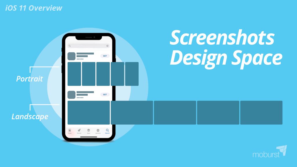
Screenshot Design Space
You can choose your app’s screenshots to appear in either portrait or landscape mode. Portrait mode was the classic option for most apps on iOS 10. Before iOS 11, users were only able to see 2 screenshots in the search page. Now, users are able to see 3 screenshots, which changes everything. How so? Since more screens are shown, each individual screen ends up being smaller. So while before you were able to clearly read a caption, now you have to use 25% bigger font. With portrait mode, your 3 screenshots are the most important because they’re the ones that users see right away. iOS 11 has also brought some changes to the landscape mode option. Compared to portrait mode, where users see 3 screenshots, in landscape mode users only see the first one. However, that one landscape screenshot has the potential to blow users away. Here’s how: After a user searches for something in the store, they’ll see a list of apps that fit their search criteria. Based on our research, approximately 70% of users will download an app directly from the search results page. They won’t click in to see the app’s page. They’ll make a quick decision based on what is visible on the search page: the first screenshot, the title, subtitle, rating and logo. The other 30% will actually click to see the app’s page and learn more. Out of the 30% who enter the app’s page, 50% will either download or leave right away. Therefore 85% of the users will base their decision on the first landscape screenshot.
This is why it’s crucial to give users a good first impression of your app.
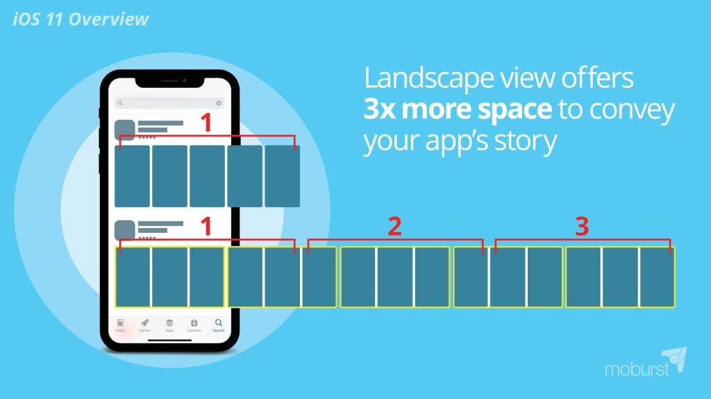
Landscape offers 3x more space
You read that right. You can benefit from 3x more space using landscape-oriented screenshots. How is that you ask? Well, whether you choose portrait or landscape mode, you are only entitled to 5 screens. But since the landscape is larger than a portrait sized picture, you are able to convey your story with so much more space. One of our strategies to get the user’s attention was to break each of the 5 screenshots into 3. This way you essentially have 15 portrait images, which look like 3 landscape images. We maximize the space landscape has to offer with this clever illusion. The uniqueness catches users’ attention in the store and brings our clients incredible results.
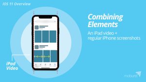
Combining elements: regular iPhone screenshots + iPad video
Since Apple prefers videos, it will always place your video as the first screenshot, no matter the size. This is important to keep in mind when combining elements like an iPad video and iOS 11 screenshots. Because the iOS 11 screenshots are smaller than in the past, and the iPad video is larger than normal, the first screenshot (the video) will look much larger than the rest. Because of the difference in size, it all ends up looking off. At first, this sounds like a problem, but it could actually work to your advantage. Because it looks aesthetically different and “wrong”, it catches the user’s eye and grabs their attention. So, if your app’s performance is as important to you as branding (and perhaps even more), this could be a great opportunity.
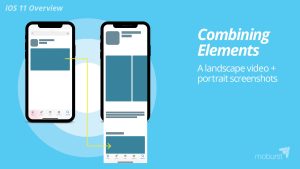
Combining elements: portrait screenshots + landscape video
The same holds true when combining portrait screenshots with a landscape video. The video will be shown first at the search page, however when tapping into the app’s page, the video will be shown under “a closer look” title, below the screenshots. It’s an aesthetic behavior that offers apps the best of both worlds. In the search page, you can be bold and show users a landscape video, which catches the eye. Then, within the app’s page itself, users can view portrait screenshots that can lead to exploration. They will be encouraged to scroll through the screens, which drives more engagement within the store.
iPhone X Creative Design
Screen size
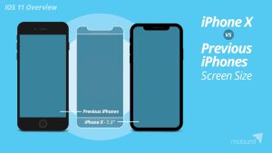
When optimizing your App Store elements for iPhone X, a lot should be taken into consideration. For starters, the iPhone X’s screen is taller, which is important to keep in mind when designing your screenshots. It’s the first time Apple has launched a new device and hasn’t made it mandatory for marketers to upload resized screenshots. Within the iPhone X screenshots, you must present your app within an iPhone X device, if you choose to show an actual device in the screenshot. This means that it’s not just another resolution for your screenshots, but the way you present the app actually needs to be taken by an iPhone X. It also means that because the device is taller and thinner, you need to modify the texts to fit the new size. Our next points will discuss why it’s better to optimize your current screenshots, rather than update them for the iPhone X.
Portrait mode in the App Store search page
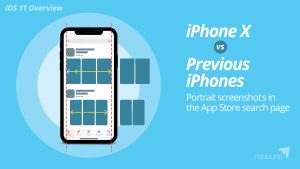
When thinking about your app’s appearance in the search results page on an iPhone X, it’s important to note that portrait screenshots appear much smaller. The screenshots are thinner, taller, and narrower than older iPhone models. You have less space to convey your message and tell your story. Therefore, you need to use a much bigger font size for any text. The screenshots on older iPhone models are more proportional, and fit better within the given space.
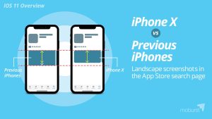
Landscape screenshots in the App Store search page
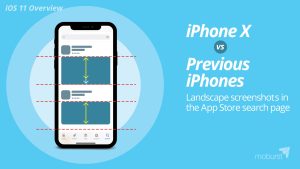
Just like portrait screenshots, landscape ones also appear smaller in the iPhone X. Landscape screenshots are shorter, leaving marketers with less space to present their story. As an agency with years of experience in the field, we use landscape screenshots since the release of iOS 11, but don’t necessarily recommend optimizing them for the iPhone X. From our initial AB tests, we didn’t find that the iPhone X new screenshot sizes convert better.
Portrait screenshots in the app page
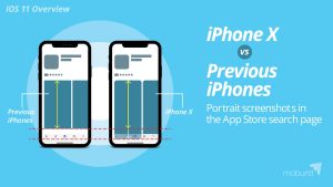
Now let’s explore the actual app page, after a user clicked on it in the search results page. Portrait screenshots don’t fit in the screen. They’re cut off, forcing users to scroll down to view the entire image. It’s as if the lower part of the image isn’t important, because without extra effort, it won’t be seen by anyone. Imagine putting your logo or call to action on the bottom right-hand corner of each screenshot. It would never get seen since users rarely scroll down.
Landscape screenshots in the app page
Landscape screenshots are similar to portrait ones within the actual app page, in that they are smaller. You lose about ⅙ of the screen. Shorter screens means less space, less space means less opportunity to draw and attract the user’s attention.
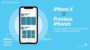
iPhone X screenshots combined with regular video
As previously mentioned, promo videos are critical. Because they start playing automatically (muted), they do an incredible job of grabbing the user’s attention. They get users to convert, especially when the video is landscape. When combining a portrait video, created for older iPhones, with iPhone X screenshots, it usually ends up looking mismatched. The video will keep its original size, while the screenshots will be significantly smaller. In order to avoid that, we recommend optimizing all your elements, including videos. We recommend optimizing all your elements, including videos, but of course, it will take time and money.
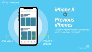
iPhone X screenshots combined with iPad video
Since Apple automatically combines elements, like iPhone X screenshots with an iPad video, you don’t have much choice. If you optimize for iPhone X and have an iPad version video, it will look mismatched within the iPhone X. Your only option is to completely take the video out from your iPad version or recreating a video for iPhone X.
iOS 11 Screenshots – Best Practice Conclusion
As is clear, the release of iOS 11 and iPhone X have changed a lot within the App Store. We definitely suggest optimizing your app and its elements for iOS 11. We also suggest optimizing your app itself for the iPhone X, as you don’t want to give your users a bad experience. If you want to optimize your App Store screenshots for the iPhone X, make sure to AB test it before going live as currently it may hinder you conversion rates.


