
App Store Success: Learning From The Best | Games Category

In this series, we’ll take a look at some of the leading apps out there, and what they’re doing right (and wrong!). We’ll unpack their creative strategies and look at real-world learnings when it comes to App Store success. In this particular post, we’re going Android, taking a look at the Google Play Store. Specifically, we’re looking at the Games category, in the “Top Free” section of the charts. The top 3 free ranking games are currently Drag n Merge Block Puzzle, Hopping Ball, and Brawl Stars. First off, we’ll look at the chart leaders.
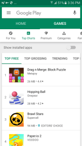
Image from Google Play Store
App Names
The No. 1 ranked app, “Drag n Merge Block Puzzle”, specifically says what type of game it is, which will also help when searching for block puzzle games. “Hopping Ball” keeps it simple, while “Brawl Stars” goes with a strong brand-type name.
Icons
As expected for the category, icons are bright and full of color, each trying to draw the eye more than the next. Generally, top ranking apps in this category avoid small details in their icons, although “Drag n Merge Block Puzzle” have added these details which can lead to some degree of intrigue, “pulling” the user in to find out more.
Other Specifics
- All of these apps have a high rating (4.4 and 4.2 respectively for top 2 apps)
- Brawl Stars gets an “Editors Choice”
- Remember: Developer’s name is displayed prominently!
Next, we’ll take a look at each one, identify common design trends and themes, and use these to give you the inside scoop on what today’s winners are doing, so that you can incorporate it into your own app. First, what is it that the user sees when opening an app’s page on the Play Store? The main screen for the app store listing prominently displays the following above the fold:
- App icon
- Name
- Developer
- Category
- Ranking highlight if relevant (e.g. “#1 Top Free”)
- Monetization info (“Contains ads” or “In-app purchases”)
- Rating and number of reviews
- Size
- Content rating
- Number of downloads (often cut off, user has to scroll)
- Screenshots
As these are all the levers available to pull at this point, each one becomes particularly important. These are the essential tools you have to grab a user’s attention, and convince them to install your app.
- “Drag n Merge Block Puzzle”
This app uses screenshots with a stylized hand to illustrate how the app works. It’s simple, functional, and non-intimidating.
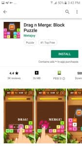
Image from Google Play Store
- “Hopping Ball”
This app has gone with a video to lead their screenshot section. Videos in the Play Store do not autoplay, and Hopping Ball has ensured that their video screenshot is engaging enough to draw the user to press “play”. Videos open up in YouTube, in landscape orientation. There’s also a space for a description under the video, which has perhaps been under-utilized in this particular app.
After the video, flowing left to right, follow the screenshots. These are very basic, literally just showing a screenshot from the game itself. 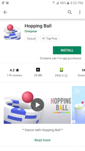
Image from Google Play Store
- “Brawl Stars”
This app (which has over 50m downloads) also leads with video, whose static opening screen shows a beautiful graphic displaying the characters, name of the app and its logo. This showing of the logo is important, as it pulls the thread of consistency throughout the experience for the user.
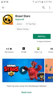
Image from Google Play Store
The video itself jumps straight into exciting gameplay, real sounds, and well-designed splash screens that tout the game’s unique attributes. Note that the app brings you into the action immediately – most users will not watch the whole video.
The screenshots following the video show elements of the gameplay itself, the main characters, and highlights such as “Unlock New Brawlers”. It’s no surprise this app is nailing all the right things – it’s developed by the same makers as Clash of Clans, Clash Royale and Boom Beach. 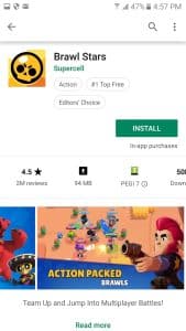
Image from Google Play Store
Common Threads and How To Apply Them To Your App
- Keep it simple: across all of these winners, design is simple and uncluttered. Colors are bold and eye-catching, and you’re grabbed even from the moment you first see the app icon.
- Details Matter: seemingly small things such as the description under the video, or the captions on screenshots, can elevate the entire experience and demonstrate to users that this particular app is considered, and offers value.
- Consistency: It’s important to pull common “threads” throughout the Play Store experience. It could be the repetition of a logo, or even just colors and fonts. Again, it makes for a more cohesive experience for the user, showing the quality of the offering.
- Get Creative: Sure you can just show actual screenshots, and a video just of gameplay. But by adding creative assets and text, you can really engage users who are one action away from becoming lifelong fans, or visiting the next app’s page.
Learning From The Best
These apps have done some of the right things to get to the top. Of course, there are other factors involved, but app creatives and design have an out-size impact on an app’s Play Store performance.
Related Articles

Moburst’s WWDC25 Digest: Expert Insights for App Growth

The Ultimate App Launch Strategy Guide for 2025 & Beyond
