

In a world with so many options and so much noise, beautiful design can be the edge that gets products or ideas noticed, and sets them apart from others. As a mobile marketing agency full of mobile app experts, Moburst brings you ten of the hottest mobile design trends of 2021 that can be applied across the mobile sphere. Whether it’s app store screenshots, social media ads or app design itself, these are the tricks to bear in mind. If you want to keep your finger on the pulse even more, consider conducting an app competitor analysis to understand what design trends your competitors are using and how you can implement them into your own strategy.
Design Trends: Then and Now
Trends, by their very nature, change according to the times. What was big last year won’t necessarily work this year – in fact, getting a trend wrong can lead to people subconsciously avoiding your product or service. So it’s important to take these things into account when brainstorming design ideas. For example, where once big bold headings and “in your face” images were the “thing,” a big trend we’ve seen grow in popularity in 2021, is brands exuding personality and style through a classy simplicity. Here are some practical ways you can give your brand the personality it deserves.
1. Design for Dark Mode
Dark mode has been adopted by most major apps, including Facebook’s entire app roster, as well as operating systems Apple and Google. In 2021, you can’t ignore the millions of device users who will be browsing their devices against a darker backdrop. It’s one of the biggest mobile app design trends that’s here to stay. So, particularly when designing app store screenshots and social media ads, the colors you use must be able to stand out against a black backdrop as well as the default white. If you get it right, your screenshots and ads will look vibrant on both. 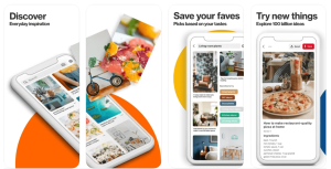
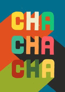
2. Bold Fonts
The past few years in design have seen a migration from smaller, longer form text to fewer, bolder words. Everything is geared towards ease. The easier it is for users to consume your conveyed message the better. Since bold text is easier to read, it’s also a lot more attention grabbing and can therefore lead to more conversions. 
3. Panoramic Galleries
Split your screenshots up and keep users scrolling. Make your designs span across two or more screenshots to encourage users to continue scrolling through. Increased engagement is better for your CVR. 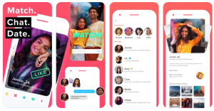
4. 3D Graphics
When you use 3D graphics, you’ve got space on the page for much more information. For app design, it’s crucial to be able to transmit as much information while leaving enough white space for a positive user experience. 3D graphics allow for both efficiency and the “wow factor” simultaneously.
5. Illustrations
Illustrations can be used in app design for user onboarding and tutorials, or to add a creative touch to any design. They’re engaging, fun and can instill more emotion into the design. Tapping into users’ emotions is a positive way to increase engagement and conversions. Using illustrations is a great tool for creative storytelling, and you should always try to tell a story through your designs. 
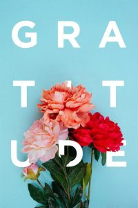
6. Typography Design
Typography is the technique of arranging text or type. It’s so much more than just putting words on a page, it’s really an art. It’s often responsible for the first impression people get of your brand, so it’s super important to nail this – and stay consistent throughout. As much as typography is more technical in choosing the right fonts and spacing, it had the ability to evoke emotion within people. The way a sign, book cover or poster looks, has a huge impact on the emotions the viewer will feel or the actions they may take.
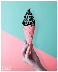 Good typography within your designs is incredibly important. It can create a “feeling” within people, and even more, encourage them to keep on reading or click through to find out what’s next. When thinking of typography, take the latest trends into account. Consider creative hand drawn letters, spacing, and bold colors to get your point across effectively.
7. Illustrated & Real Life
Another extremely popular design trend we’re seeing a lot of in 2021 is the mix of illustrated and real life items. This trend gives the design a modern yet practical feel. In the webpage below you can see real life food items in the background with an illustrated font on top. Combining the two adds something special and new to the design that people aren’t used to. 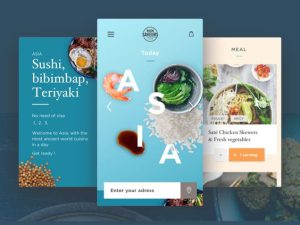
8. Geometric Shapes
Whether it’s circles, ovals, squares, or triangles, geometric shapes are pleasing to the eye. They are balanced and easily recognizable, and suggest structure and clarity. Using geometric shapes within your design can really help guide the eye of the user through your work. Geometric shapes are simple, so they allow other aspects of your design like words or images to shine through. 
 A common trend within geometric shapes is the use of wavy lines and free-form shapes. Combining rigid geometric shapes with relaxed lines and curves adds a sense of style and attention-grabbing personality.
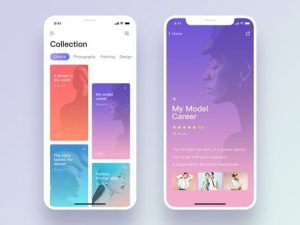
9. Flat & Solid Colors
Solid colors have a way of calming the mind and eye, and allow people to focus on certain elements without getting overwhelmed. Having a solid background is a really good option for detailed or busy products or interfaces. A solid background looks clean while keeping things interesting. 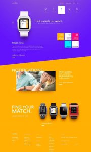 A flat and solid background can make text more discernible, compliment foreground elements, help achieve balance, and bring added freshness and liveliness to your design.
10. Gradients & Duo Tones
As the final design trend to know about, we bring you gradients and duo tones. Spotify really popularized gradients by applying duotone gradients over photos as a key branding element in pretty much all of the company’s campaigns and ads. When thinking of gradients, the iPhone X campaigns probably also come to mind, which are multicolored and have irregular blending.
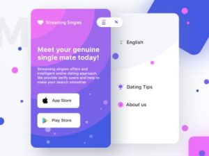
 Colors can be blended many ways, but what’s trending now is non-uniform and out-of-the-ordinary blending.
Design in Style
It’s no secret that design is one of the most powerful tools you have to set yourself apart, and can play a critical role in a product’s ultimate success or failure. Design trends change often, and you’ll want to stay in sync with what’s hot as you ramp up your marketing efforts. Even more, you will want to stand out – something we strongly emphasize when marketing our customer’s products. So keep these top ten design trends in mind when crafting your plan. With a keen eye and great design, you’re already one step ahead of the rest.
Related Articles
How to Comply with Google’s EU User Consent Policy
App Store Optimization (ASO) Best Practices for 2024 & Beyond