
App Store Success: Learning From The Best | Health & Fitness Category
In this series, we take a look at leading apps in various App Store categories, investigate factors leading to their success, and unpack their creative strategies to gain real-world learnings. Our last post looked at the Games Category within Google Play. In this post, we’ll be checking out the “Health & Fitness” category in Apple’s App Store. We’ll dive into what the winners are doing, and how that success can be replicated to help your app succeed. Top apps in the “free” category of Health & Fitness are Calm – Meditation and Sleep, Breethe: Sleep & Meditation, and Headspace: Meditation & Sleep.
App Names
First off, it’s interesting that all of the top 3 apps have included some sort of a description within their app names, taking full advantage of that space. Even the number 1 ranked app, Calm, which is well known as a brand name, took the decision to include the “Meditation and Sleep” element in their official name. Similarly, both Breethe and Headspace added descriptions after their names into the title field.
App Store Icons
Both Calm and Breethe have app icons that you would expect for this genre. Relaxing blues with white accents, and simple, easy to read lettering. 3rd-place, Headspace, has gone the other way, with no lettering, a simple circle, and its unique orange color that stands out from other apps in the category.
Other Points of Interest
- Calm won Apple App of the year in 2017, and Headspace was featured in “Best of 2018” by Apple. Both apps display this prominently in their first screenshot after their video
- Breethe touts its “3 million downloads” in its first screenshot
- Breethe and Headspace both emphasize benefits of their app, with words like “breathe”, “calm”, “mindfulness”, “focus” and “relax”
- This also serves to draw users from apps that feature these words in their app title
- Breethe ads appeared when searching for “Headspace”
Before we dive into each app, here’s a quick reminder about the (very limited) information that Apple displays on an app’s page above the fold:
- Header image (only if you are featured)
- App icon
- App Name
- Short description
- Rating and stars
- Number of ratings
- Ranking highlight if relevant (e.g. “No. 2 in Health & Fitness”)
- Monetization info (“In-app purchases”)
- Age suitability
- Screenshots (important note: not the full image)
This is not a lot of real estate to be able to convince users visiting your app’s page to download your app. What it does mean, however, is that each of these elements becomes even more important due to the scarcity of any other “levers” to pull, to convince visitors to continue down the funnel and proceed to download. Let’s take a deeper dive into these top 3 apps, particularly how they use their creative assets to increase conversions.
- “Calm – Meditation and Sleep”
The Calm app icon makes you feel relaxed just be looking at it, by using just the right colors and a considered, gentle gradient. The “header” image has mountains and a lake in it, which also goes a long way to giving over the benefits of the app. Note how consisting Calm’s branding is: from their header image to their app icon and all the way through to their screenshots. 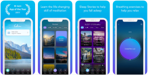 Calm uses its screenshots to showcase features of its app but also manages to show off some aspirational imagery. It leads with a video as its first screenshot, but you’ll notice how the static image before the video is played, is well designed. It encourages users to click through and watch the video. The second screenshot image, which is partly hidden on most devices, showcases the app’s awards and highlights the “calm” interface of the app. It keeps the theme of the Calm logo, mountains and a lake, which draws the user through this consistent experience.
- “Breethe: Sleep & Meditation”
Unlike the other apps, Breethe doesn’t choose to lead with a video, preferring a static screenshot to showcase its main benefits: “De-stress and sleep better in 5 minutes”. Who doesn’t want that? 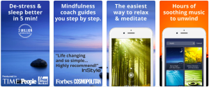 The screenshots share a common background, an image of a sunset over the sea, which also draws the user through the screenshots, encourages scrolling and provides a relaxing backdrop. Note the large font size used in the screenshots. It may not be the most beautiful looking, but an older audience, for example, will find it a lot easier to read. This also shows how knowing your audience is really critical for each touchpoint throughout the app store experience. It’s also interesting that the developer uses the screenshots to showcase how popular the app is, and specifically, how many big name publications have featured it. This is in contrast to the other winner in this category, who have chosen to show actual screens and functionality.
- “Headspace: Meditation & Sleep”
Headspace uses a clean, interesting image as its header, which sets off and further emphasizes its minimalistic yet striking app logo. 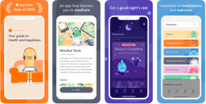 It utilizes cute characters looking at the user to grab attention, and also uses its first screenshot to incorporate a video. The combination of the characters and the video button encourage users to go ahead and watch what the app has to offer. Like Calm, the second screenshot shows off the app’s awards, although in this case a solid background is used. This also draws the user through by reflecting the colors used in the header image and logo.
Applying Common Threads to Your App
Let’s take the lessons learned from these 3 apps and turn them into actionable insights you can use right now within your app:
- Consistency: All 3 apps are consistent in terms of the colors, logos, and fonts they use. Even more than that, they’re consistent in the feel and “message” they put across. This builds users’ confidence in the app and increases the chances that they will download and use it.
- Draw the user: Unrelated screenshots or text will cause users to take one look, and then leave the page. It’s critical to tell a story: to visually guide the user through the app page’s experience, and let them discover everything your app has to offer.
- Highlight your differences early: You can see by how similar these apps are, that this category is crowded and competitive. The truth is, which category isn’t these days? That’s why it’s important to differentiate yourself early, even if it’s something seemingly small.
- Utilize social proof: This could be in the form of the number of downloads, publications you’ve been featured in, or awards your app has won. The more, the better – this is no place to be humble.
Keep It Simple
There’s a simple genius to how these successful apps have utilized the small amount of space available to them. Calm, Breethe and Headspace all put a lot of information in front of the user, but in a smart and thought-out way that encourages them to convert. These are just some of the examples you may want to explore when crafting your ASO strategy. Looking at the winners of different categories sheds light onto what works, and things you may want to test for your app. Knowing what to focus on when it comes to app success can be a challenge. With Moburst, you have a partner that’s done it before, for some of the biggest brands in the world. Get in touch to make sure your app is a category winner.

Related Articles
How to Comply with Google’s EU User Consent Policy
App Store Optimization (ASO) Best Practices for 2024 & Beyond